How to write and design CTAs that people want to click on (with examples)
What is a CTA and why does it matter?
CTA stands for call to action, and it’s text (sometimes contained in a cute little box) that tells your website visitors or people viewing your ads the action you want them to take. If you live on planet Earth (which most of you do, I think) you probably see thousands of them every day. They tell you to “Learn More” or “Shop now,” to “Download” or “Sign up.”
Don’t let their tiny size fool you. CTAs are critical to driving clicks and engagement. Don’t believe me? Here are some impressive stats:
More than 90% of visitors who read your headline also read your CTA copy. (Unbounce)
Emails with a single call-to-action increased clicks 371% and sales 1617%. (WordStream)
Adding CTAs to your Facebook page can increase click-through rate by 285%. (AdRoll)
Hopefully these convince you that writing strong CTA copy is important. But how do you write and design a CTA that people will want to click on? In this post I’ll talk you through must-know design and copywriting elements.
Design elements that will make your CTA stand out
This might seem super duper obvious, but I can’t tell you how many sites and ads I see that hide their CTAs, like they’re something to be ashamed of. Well, they’re not! Take this example from body-positive skincare line Starface. It’s kind of hard to see the “Shop Now” CTA button, right?
Why is the CTA so hard to see? Here are three reasons (also lessons in how to make your CTA visible on any marketing collateral):
Low contrast: Color contrast is the difference in light between font (or anything in the foreground) and its background and it’s a critical for making your CTA (or anything else for that matter) truly pop. In the image above, the black CTA sitting on top of a dark brown background makes it really hard to see. If this now planted seeds of doubt about whether your own CTAs have good contrast, you can use this free contrast checker tool. It’s super awesome.
No whitespace: You should know that our friend the CTA is a bit of an introvert. They hate crowded spaces. They need room to breathe.This is normally referred to as negative space or whitespace: the area between design elements. In the example above, the CTA is stuck between some busy design elements (the logo, copy, and background imagery). This makes it hard/impossible for it to stand out.
No directional cues: Directional cues are elements that draw the eye’s attention to something, in this case our CTA. Arrows are the most standard execution of directional cues in marketing design, but when you’re using real people in your images (like above) you could also have the person gaze at the CTA.
Now that I’ve been way harsh on Starface, let’s take a look at a homepage that leverages contrast, whitespace and directional cues to make their CTA really stand out.
Off Limits Cereal! You won me over with your cartooney cereal and amazing CTA design. Moving on to our second tactic…
Writing copy that people want to click on
People say that “you get what you ask for” and this is DEFINITELY the case for CTAs. Ask yourself what action you want your customers or potential customers to take. Then, clearly state it in your CTA copy. If you’re scratching your head trying to come up with actions, no worries. Here’s are some of the top verbs arranged by business type:
E-commerce: Browse, See, Get started, Shop, Buy, Snag, Claim, Get
Content: Download, View, Grab, Snag, Show, Watch, Explore
B2B/Saas: View (info/pricing), Request (demo), Start trial, Join, Try it out, Give it a try
Generic: More info, Tell me more, Learn more, Check it out, Get started, Upgrade, Create account, Log in, Search now, Join us
Once you’ve identified the verb, it’s time to make it even more clickable. Here are some of my favorite strategies:
Add Urgency: Words that create a sense of urgency for your customers can have a huge impact on your CTAs click through rate.
Good CTA: Shop
Better: Shop now, Shop summer sale, Get glasses today
Include the product: Many people coming to your site might not be super familiar with your brand or what you sell. Remind them by spelling out your product in the CTA copy.
Good CTA: Shop
Better: Shop frames, Shop unique frames, Shop and save, Shop with coupon
Include discount specifics: Offers and discounts are one of the best ways to drive clicks. YOu can include this copy in your CTAs so it’s front and center.
Good CTA: Shop
Better: Shop and save 15%, Shop one-day sale, Shop and save $100
Tell people when things are free: I like free. You like free. Everyone likes free.
Good CTA: Create account
Better: Create free account
Mix and match for the best outcomes!
Create free account today (urgency and free)
Get my free gift today (urgency, product, free)
Finally, the funnel
I have some bad news: not everyone is ready to “Shop Now.” Your CTA copy should be aligned to the stage that your customer or potential customer is in the customer journey or marketing funnel.
For example, if your customer is not aware or just recently became aware of your brand or products, you should drive them to take actions that get them closer to even considering buying from you.
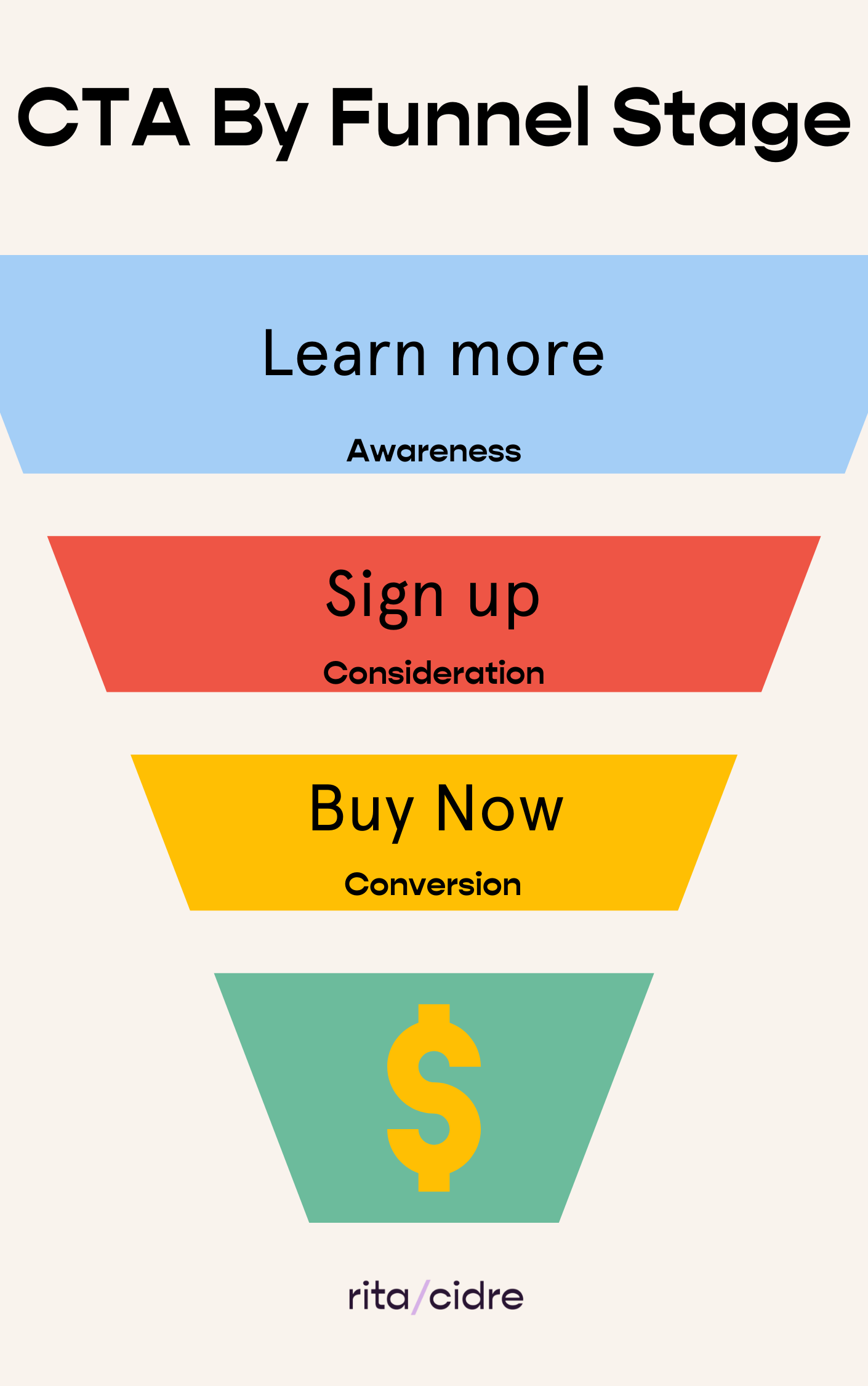
Here I show just one example of how you can align your different CTAs to stages in your customer funnel, from “Learn More” at the Awareness stage to a more forceful “Buy now” at the conversion stage.
Remember, your CTA is a clear statement of the action you want users to take. This means, you should always start them with a verb.
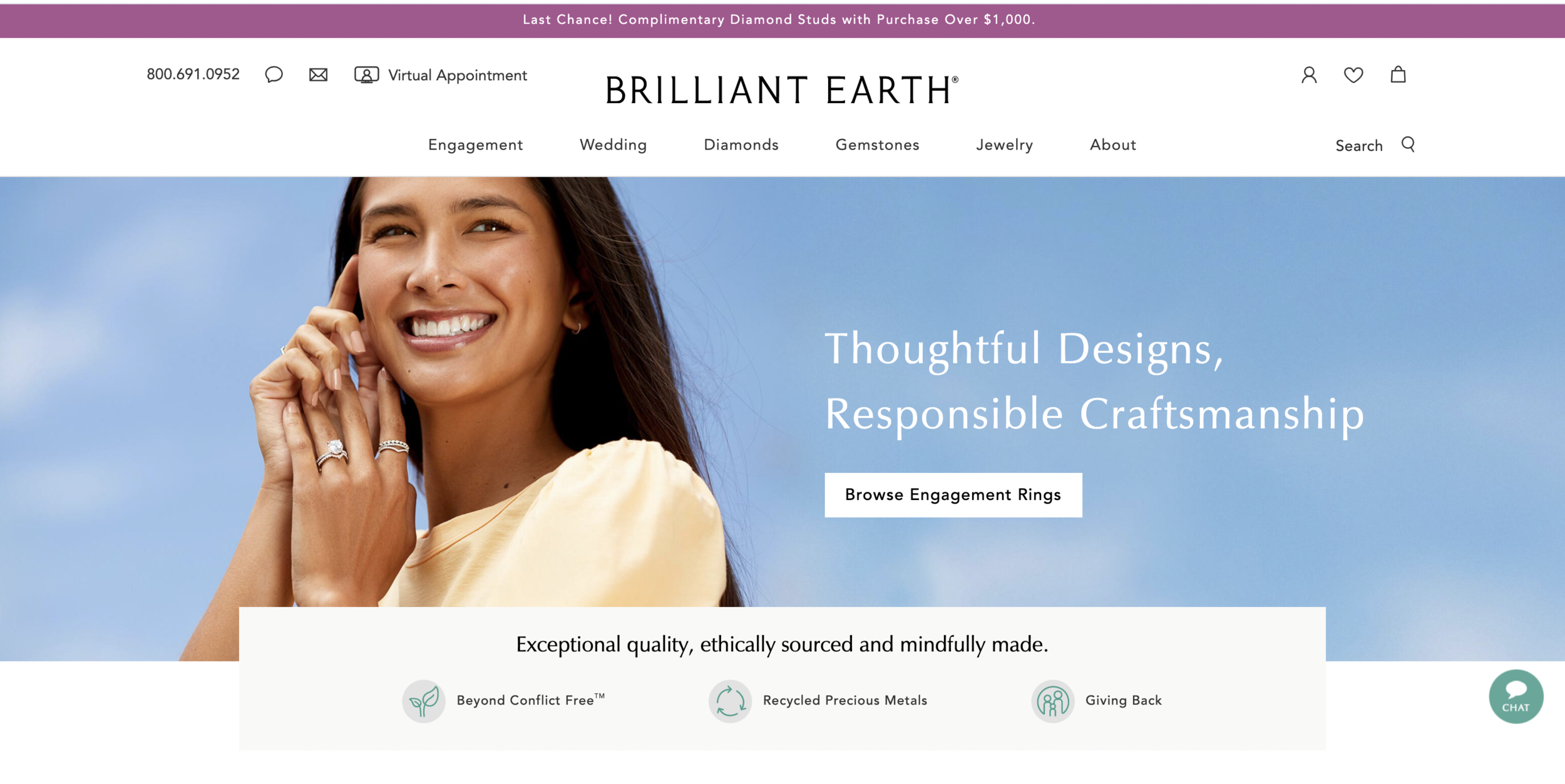
Let’s look at some examples by funnel stage. In the awareness bucket, check out Brilliant Earth’s homepage CTA: Browse engagement rings. This copy accomplishes two goals. First, it uses a low-commitment verb (browse) that won’t scare away people who just discovered the brand. Second, within the CTA button itself, they remind us what their marquis product is: engagement rings. Again, this is helpful for anyone who’s unfamiliar with Brilliant Earth’s products. Good job.
In the consideration stage, we have this example from Slack. They are encouraging us to try the product for free. But, in case we are not quite ready to do that, they also provide a secondary CTA to check out all product features. AND, in case anyone is ready to buy, they also added a “Talk to Sales” CTA. So they have a little something for everyone.
There are so many examples I could pull for the conversion stage, basically any site asking you to “Buy” or “Shop now”. I’ll add this example from Greats because they also kill it at making their CTA visible.
Get creative
Don’t let the teeny tiny CTA real estate fool you. You can get super creative when writing CTA copy. In fact, I would highly encourage you to! The world does not need another “Shop now” CTA, IMO.
Offer a quiz: In this example from Calm, instead of going for a generic “Learn More” CTA, they ask users what they need help with. This can help you offer relevant information about your product while also capturing valuable information that could be used for retargeting, among other things.
Be yourself: Marketing-expert Jenna Kutcher is an ace at on-brand, witty, unique CTA copy. Her copy is usually longer than what we typically see in CTAs, but somehow it super works. Do you agree?
In conclusion
Give your CTA some love and attention, and it will pay you back with results. Promise.


